Article: Lunara Skincare — The Ritual of Calm & Confidence
Lunara Skincare — The Ritual of Calm & Confidence

The Idea
Lunara started with a simple idea:
skincare should feel calm — not overwhelming.
Not another fast beauty brand.
Not endless products, loud claims, or complicated routines.
Something quieter.
Something intentional.
A brand that invites you to slow down, reconnect with your skin, and return to simple, meaningful rituals.
The Direction
Instead of chasing trends, Lunara is built around:
• balance over excess
• consistency over quick results
• long-term skin health over instant promises
It’s for people who don’t want more — they want better.

Project Overview
This project was developed as a complete brand system — designed to show how Lunara would exist in the real world.
From strategy to visual identity, packaging, and digital experience.
Scope included:
• Brand strategy & positioning
• Visual identity system
• Packaging & product concept
• Website & UX design
• Content direction & marketing foundation
My role:
I led the full creative direction — from defining the strategy to building the entire visual and digital system.

The Visual World
Lunara is built around stillness.
The visual language focuses on:
• natural skin textures
• water, reflection, and movement
• soft light and quiet moments
Nothing feels forced or overly polished.
It’s designed to feel human.
Calm.
Balanced.

Brand Strategy
Lunara is positioned as a slow beauty brand.
That means:
• fewer, more intentional products
• simple routines
• a more respectful approach to skin
No aggressive messaging.
No pressure.
Just clarity, trust, and consistency.
Visual Identity
The identity is designed to feel refined — but not distant.
![]()
Logo System
Clean, flexible, and easy to apply across digital and physical spaces.
It adapts without losing its character.

Color Direction
Soft greens, warm neutrals, and off-whites.
Inspired by:
• nature
• water
• moonlight
Nothing high contrast.
Nothing demanding attention.
Just a calm, balanced visual environment.

Typography
Elegant, editorial — but still readable.
It gives the brand a premium feel
without becoming cold or difficult to engage with.


Product & Packaging
Everything is designed to feel effortless.
• clean forms
• balanced proportions
• soft, neutral finishes
The goal wasn’t to create something decorative.
It was to create something you reach for every day — naturally.
Without friction.

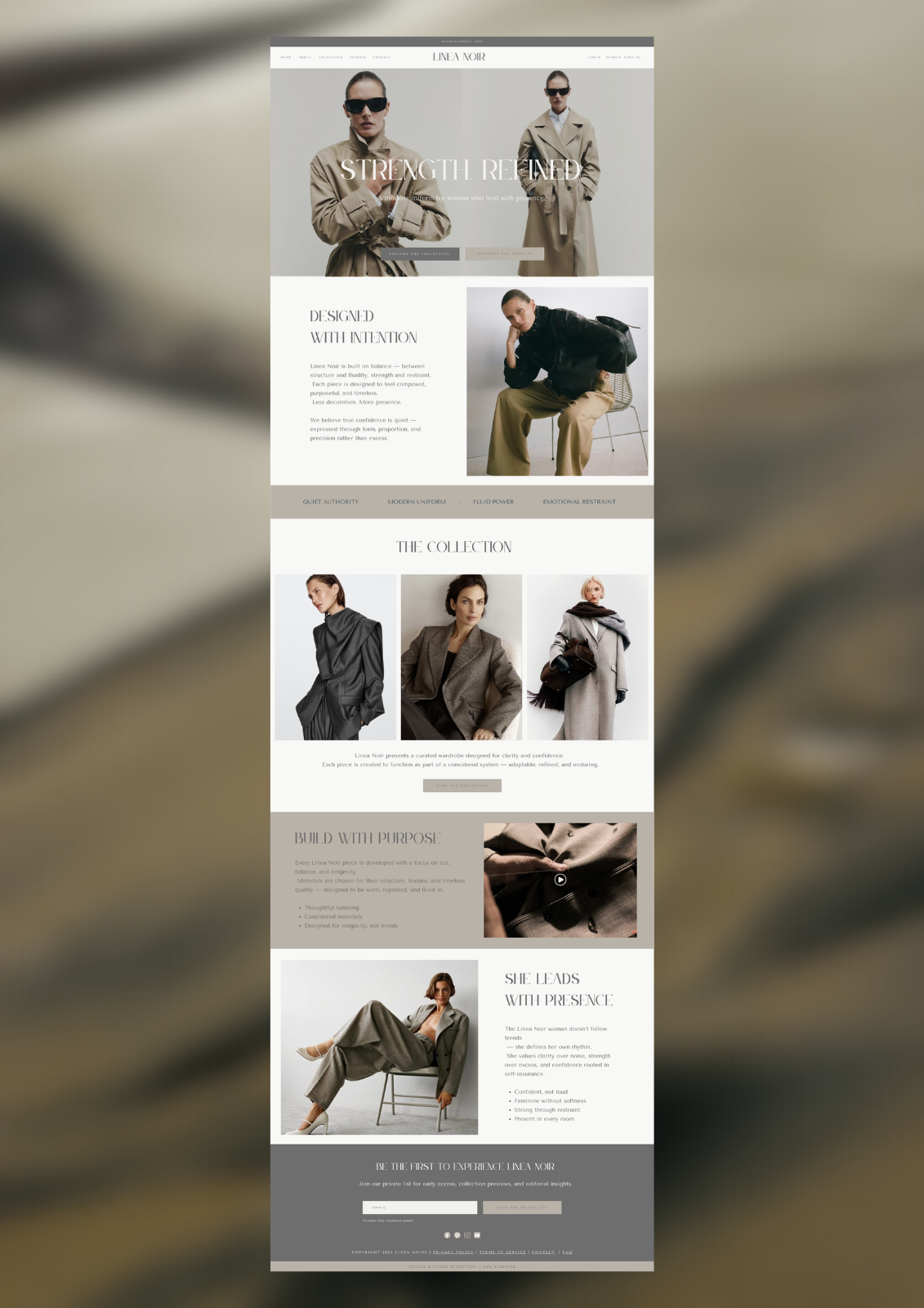
Digital Experience
The website follows the same principle:
clarity over complexity.
• simple navigation
• clear structure
• mobile-first thinking
• space to breathe
Nothing competes for attention.
The experience is calm, intuitive, and easy to move through.

Content Direction
Lunara doesn’t “sell loudly”.
It communicates through:
• education
• rituals
• consistency
Content focuses on:
• skincare understanding
• product use in real life
• textures, details, and routines
• calm, everyday moments
Even user-generated content is curated carefully — to keep the visual world consistent.
Marketing Approach
The strategy is simple:
build trust first.
No urgency.
No pressure tactics.
Instead:
• guide
• educate
• support

Email Strategy
The email experience follows the same idea:
• welcome and introduce the brand
• share useful skincare insights
• guide product choices
• offer gentle next steps
Always helpful.
Never pushy.

The Outcome
Lunara is not just a concept.
It’s a complete brand system — designed to exist across product, digital, and experience.
Everything connects.
Everything feels aligned.
Final Thought
This project reflects how I approach brand building:
not starting with visuals — but with direction.
Because when the direction is clear,
everything that follows becomes easier,
stronger,
and more consistent.
Strategic Foundation
Every decision — from color to content — was built on one idea:
clarity creates confidence.