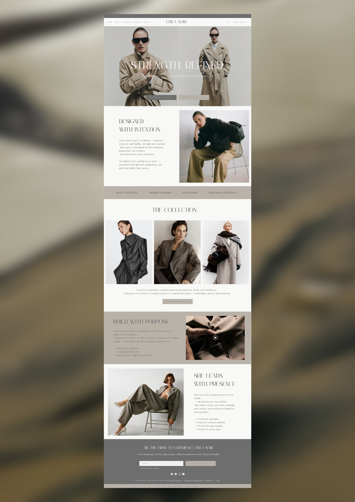
Article: VYRA — Systems For Controlled Influence
VYRA — Systems For Controlled Influence

The Idea
VYRA started with a different intention:
not expression — but control.
Not creating more content.
Not chasing attention.
But building a system
that shapes how attention works.

The Direction
VYRA is built around one idea:
influence should be structured — not random.
Instead of reacting to trends,
the brand creates a controlled visual and strategic system
that can scale without losing clarity.
Project Overview
VYRA was developed as a conceptual brand system — designed for a digital-first, high-impact presence.
Scope included:
• Brand strategy & positioning
• Visual identity system
• Digital experience (website & UI direction)
• Content system & visual language
• Campaign and communication structure
My role:
I led the full creative direction — from defining the strategic foundation to building the visual system.

The Visual World
VYRA is built on energy — but controlled energy.
• light and motion
• contrast and depth
• precision and structure
The visuals feel dynamic, but never chaotic.
Everything is directed.

Brand Strategy
VYRA is positioned as a system-driven brand.
Not built on personality.
Not dependent on trends.
But structured around:
• repeatable visual language
• consistent messaging
• scalable content systems
The goal is not just visibility.
It’s controlled influence over time.
Visual Identity
The identity reflects clarity, precision, and strength.
![]()
Logo System
Bold, minimal, and adaptable.
It holds presence across digital environments
without losing sharpness or recognition.

Color Direction
Deep tones with contrast.
Blues, reds, and dark neutrals — used intentionally, not excessively.
The palette creates intensity
without overwhelming the system.

Typography
Modern, sharp, and highly legible.
Designed for digital clarity and impact
across screens and platforms.

Digital Experience
The website is designed for focus.
• clear hierarchy
• fast understanding
• direct navigation
No distractions.
Everything moves toward action.

Content System
Content is not random output.
It follows a structure.
• repeatable formats
• visual consistency
• clear message hierarchy
Each piece of content strengthens the system — not just fills space.

Marketing Approach
VYRA does not rely on volume.
It relies on precision.
Instead of constant posting,
the strategy focuses on:
• clarity of message
• strength of visuals
• consistency over time
The goal is not to be everywhere.
It’s to be recognizable and controlled.

Campaign Direction
Campaigns are designed as systems — not one-off ideas.
Each campaign connects to the larger brand structure.
• visual continuity
• message alignment
• scalable execution
Nothing exists in isolation.

The Outcome
VYRA becomes more than a brand.
It becomes a framework for influence.
• structured
• scalable
• controlled
Everything works together.
Everything is intentional.

Final Thought
This project represents a different layer of my work.
Less about emotion.
More about structure.
Less about expression.
More about control.
Because in today’s landscape,
attention is easy to get — but hard to control.
Strategic Foundation
Every decision was built on one idea:
systems create power.